ABOUT THE PROJECT:
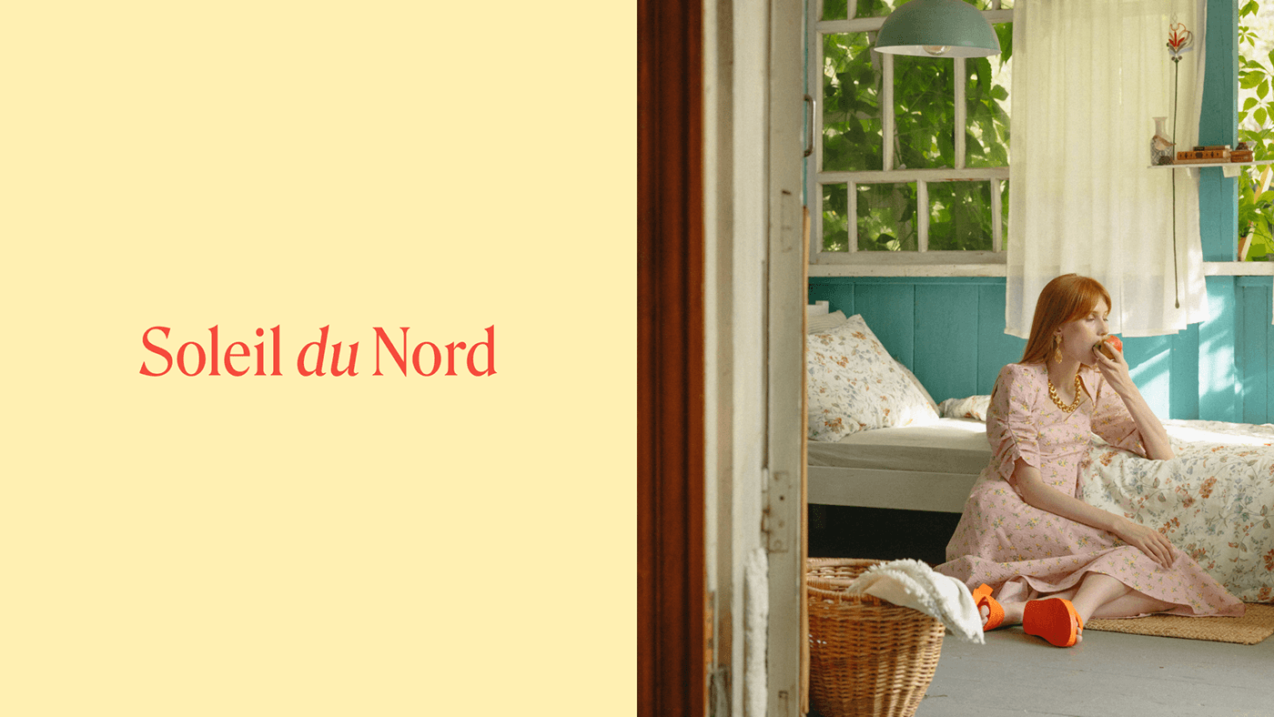
Soleil du Nord ("Nothern Sun" in French) is a middle-up brand of knitwear. Target audience are women at the age of 20 to 40s. The brand's mission is to give women the opportunity to add color to their wardrobe, evoque a feeling of security and nostalgia of a "granny sweater".The deliberate imperfection of the brand's pieces refers to things that are handmade with care for you personally. The hero of the brand is a successful girl, she has a responsible job, but she preserved her childlike spontaneity and joy of life.
DESIGN SOLUTION:
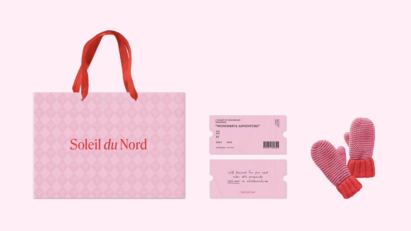
To creat the visual identity of the brand we took inspiration in our childhood. Children are not afraid to express themselves through creativity and to show their emotions openly. As we grow older, social attitudes teach us to be more restrained. We took the idea further and created the dairies with the photos from our childhood. The diaries can be purchased separately in addition to the knitted items. The photos on the dairies and giftcards were hand-embroidered. In the choice of fonts, colours and graphic elements we also wanted to reflect the playful and creative character of the brand.


DIARIES:
Did you have a diary as a child, where you wrote down your most important secrets, collected memorable moments and tickets on its pages? We decided to create such diaries in the style of the brand to give customers the opportunity to return to these moments of childhood and youthful carelessness.


